Staff Portal For IRA Operational Utilities
A B2B2C fintech startup had a staff portal built without UX involvement — unintuitive utilities that slowed down operations and customer care work and made onboarding new staff painful. As the company scaled from 15 to 110 employees, that portal needed to scale with it.
How might our staff portal scale with and optimize our internal processes — for a B2B2C business managing white-labeled programs for dozens of client partners, not just its own accountholders?
My Role
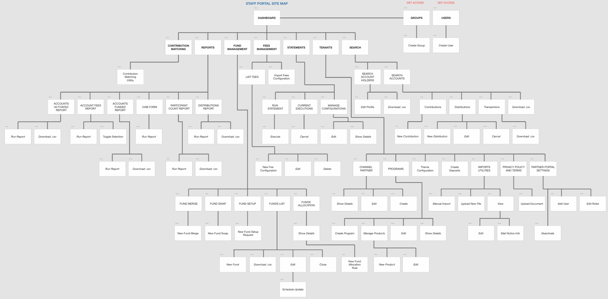
Solo UX designer from initial research through development-ready prototypes, on a system that grew to 180+ screens over multiple years. I led requirements gathering and annotated wireframes explaining operational processes to engineering, and led negotiation of design tradeoffs driven by a highly complex backend architecture. As the UX team later expanded, I mentored and oversaw additional designers building new utilities for emerging operational needs (all work shown here is my own individual design).
Process
- Ran independent workshops with Operations, Customer Care, and senior engineers to map daily routines, pain points, and technical constraints
- Documented internal workflows in detail and translated them into wireframes annotated for both stakeholders and developers
- Negotiated design tradeoffs directly against backend architecture and automated transaction/account-creation processes
- Delivered dashboards, accountholder search, partner management, and bulk-action utilities — expanding to 180+ screens as new operational needs emerged over multiple release cycles
- Mentored an expanding UX team on designing additional utilities as the company continued to scale
Key Decisions
Two role-specific dashboards instead of one shared view
Options considered: A single unified daily-monitoring dashboard for all staff vs. separate dashboards built around each team's actual routine.
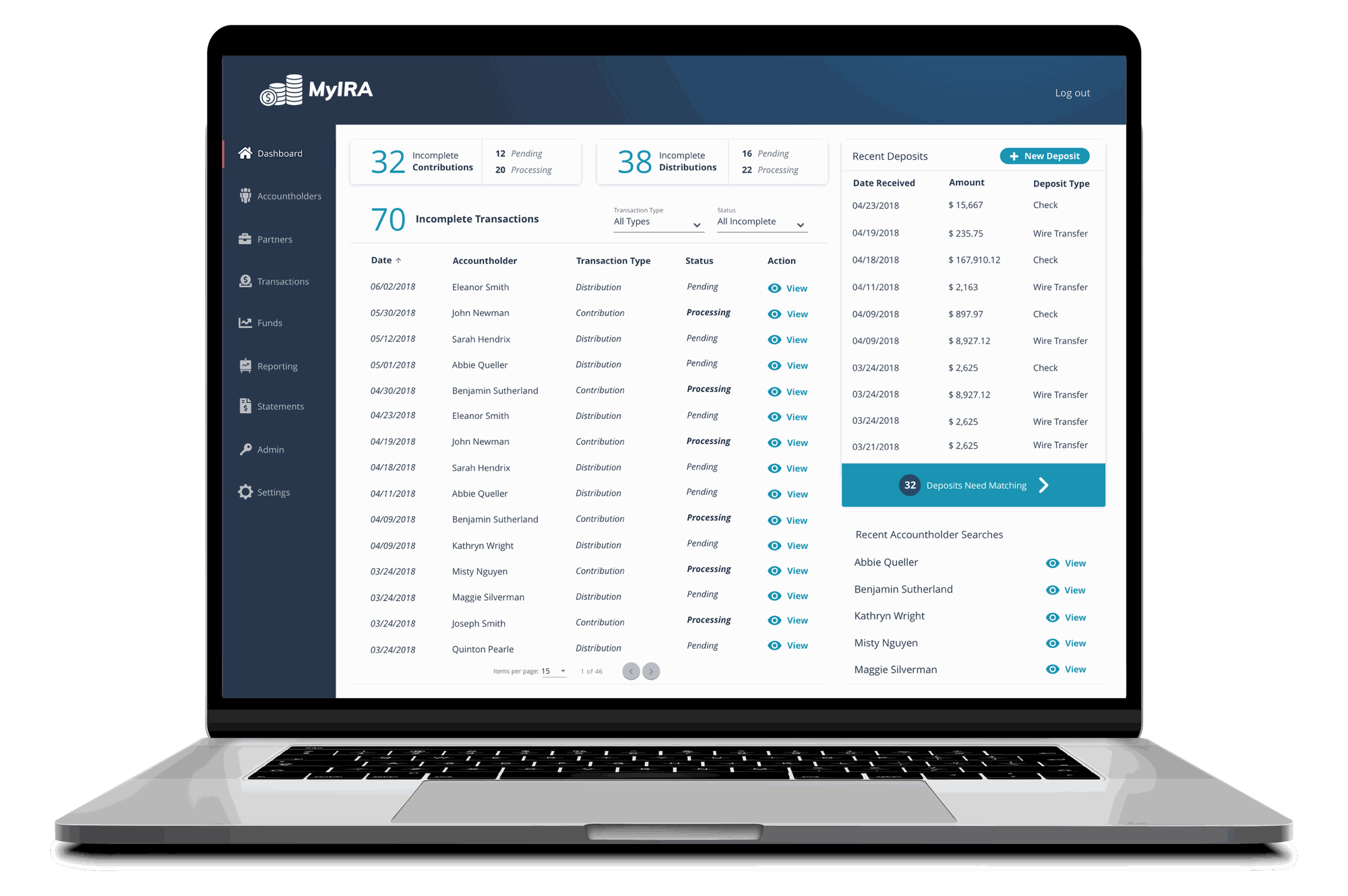
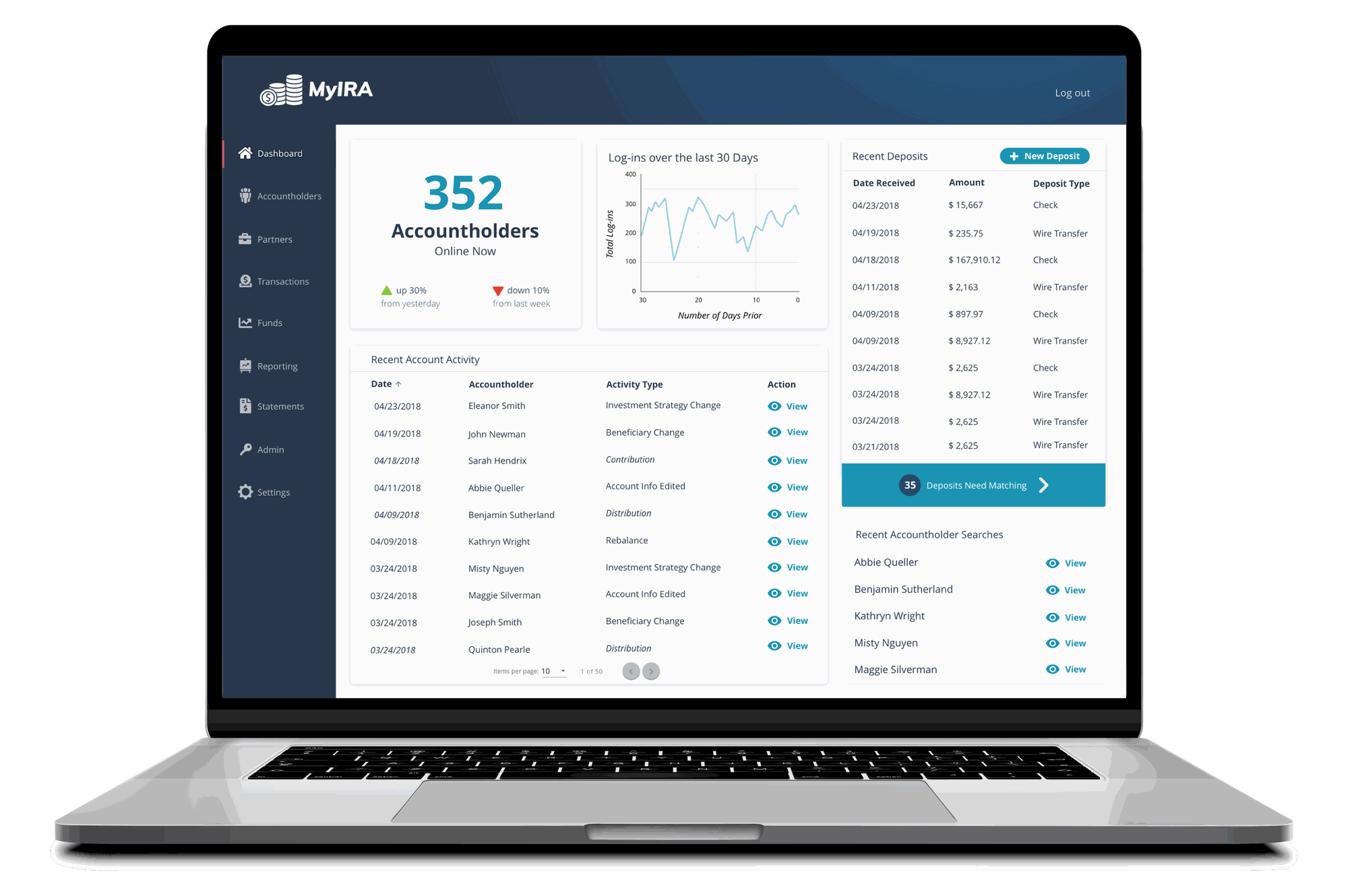
Decision: Designed two distinct dashboards — one for Operations focused on transaction monitoring, one for Customer Care focused on accountholder activity.
Why: Workshops with each team surfaced fundamentally different daily tasks and priority metrics. A shared dashboard would have forced every user to filter out information irrelevant to their job, slowing down the exact daily monitoring work the tool existed to speed up.
Operations Team Dashboard — Transaction Monitoring
Customer Care Dashboard — Accountholder Activity
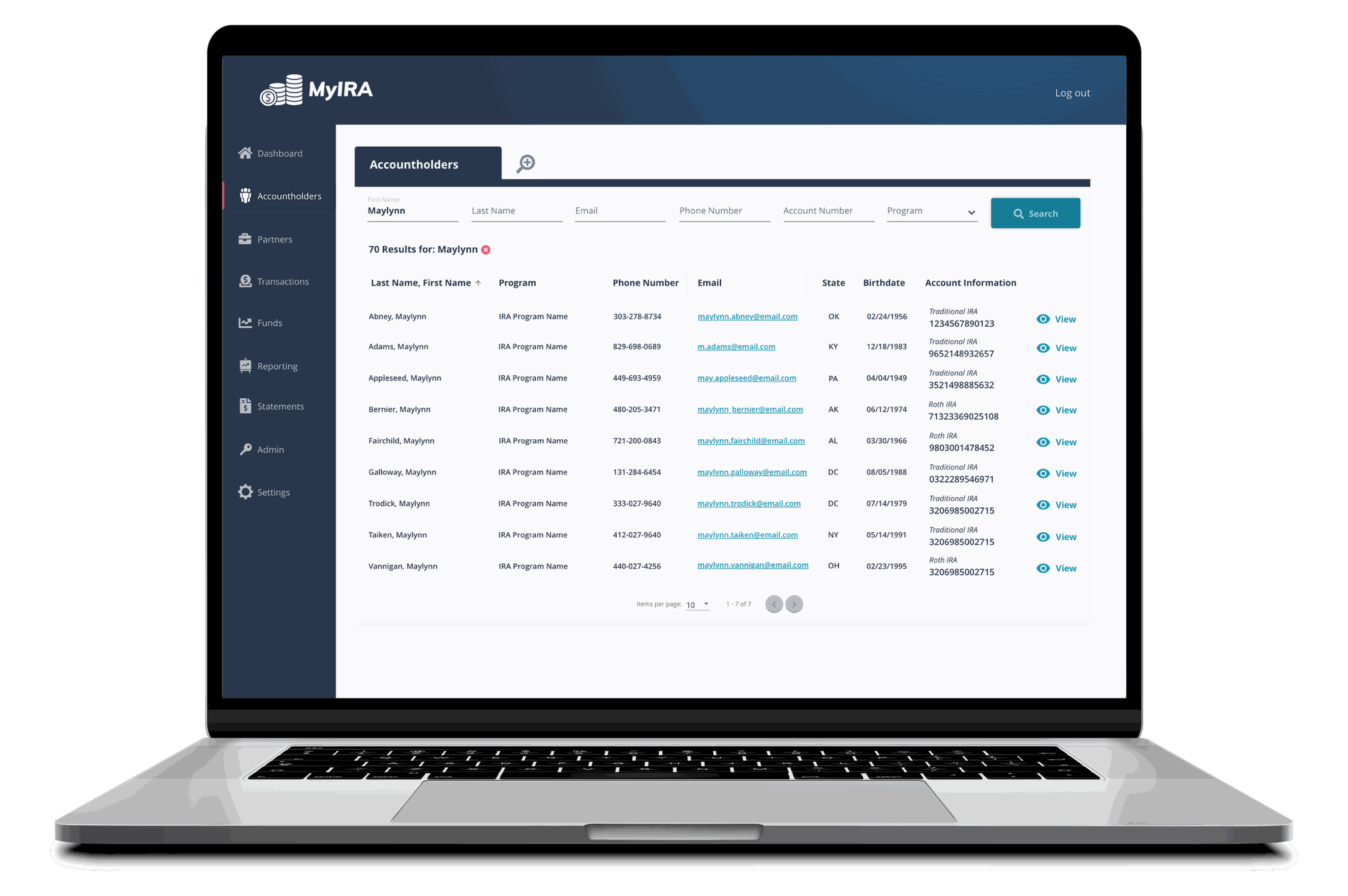
Multi-tab accountholder search to target average handle time
Options considered: A single-profile search-and-view flow vs. letting staff hold multiple accountholder profiles open in tabs simultaneously.
Decision: Built a multi-tab search experience so customer care staff could search for and view several accountholder profiles at once.
Why: Real calls often require cross-referencing multiple accounts. A single-profile flow would force staff to lose context switching back and forth mid-call — directly working against average handle time, one of the key customer care metrics identified in requirements gathering.
Non-linear partner onboarding with contextual empty states, not a fixed wizard
Options considered: A rigid, linear step-by-step onboarding wizard vs. a flexible partner profile with guided empty states.
Decision: Designed partner profile empty states that surface next steps and flag technical blockers, rather than forcing operations staff through a strict sequence.
Why: Onboarding a new client business partner is inherently non-linear, with interdependent steps and real technical constraints. Empty states let staff work in whatever order matched real circumstances while still providing guardrails, instead of a wizard that would break the moment reality didn't match the happy path.
Negotiated designs directly against backend architecture before finalizing screens
Options considered: Hand off idealized designs to engineering and iterate after the fact vs. embed technical negotiation into the design process itself.
Decision: Ran independent working sessions with senior engineers to understand backend architecture and automated processes, then negotiated design tradeoffs before screens were finalized.
Why: This fintech's backend was highly complex, with automated processes governing transactions and account creation. Designing in isolation would have produced screens that required costly rework; negotiating up front kept scope realistic and protected delivery timelines.
The Design
Accountholder Search & Profile
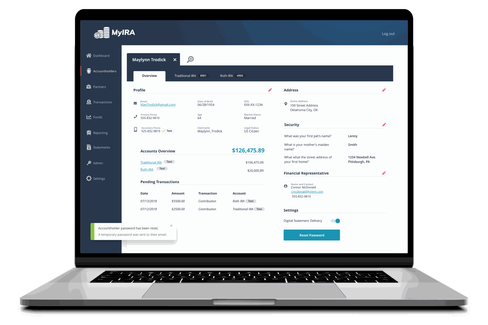
Staff can search for accountholders and view their accounts at-a-glance, with the first profile screen surfacing everything customer care needs at the start of a call.
Accountholder Search — the view after a search is initiated.
Accountholder Profile — the first screen surfaces everything customer care needs at the start of a call.
Partner Management
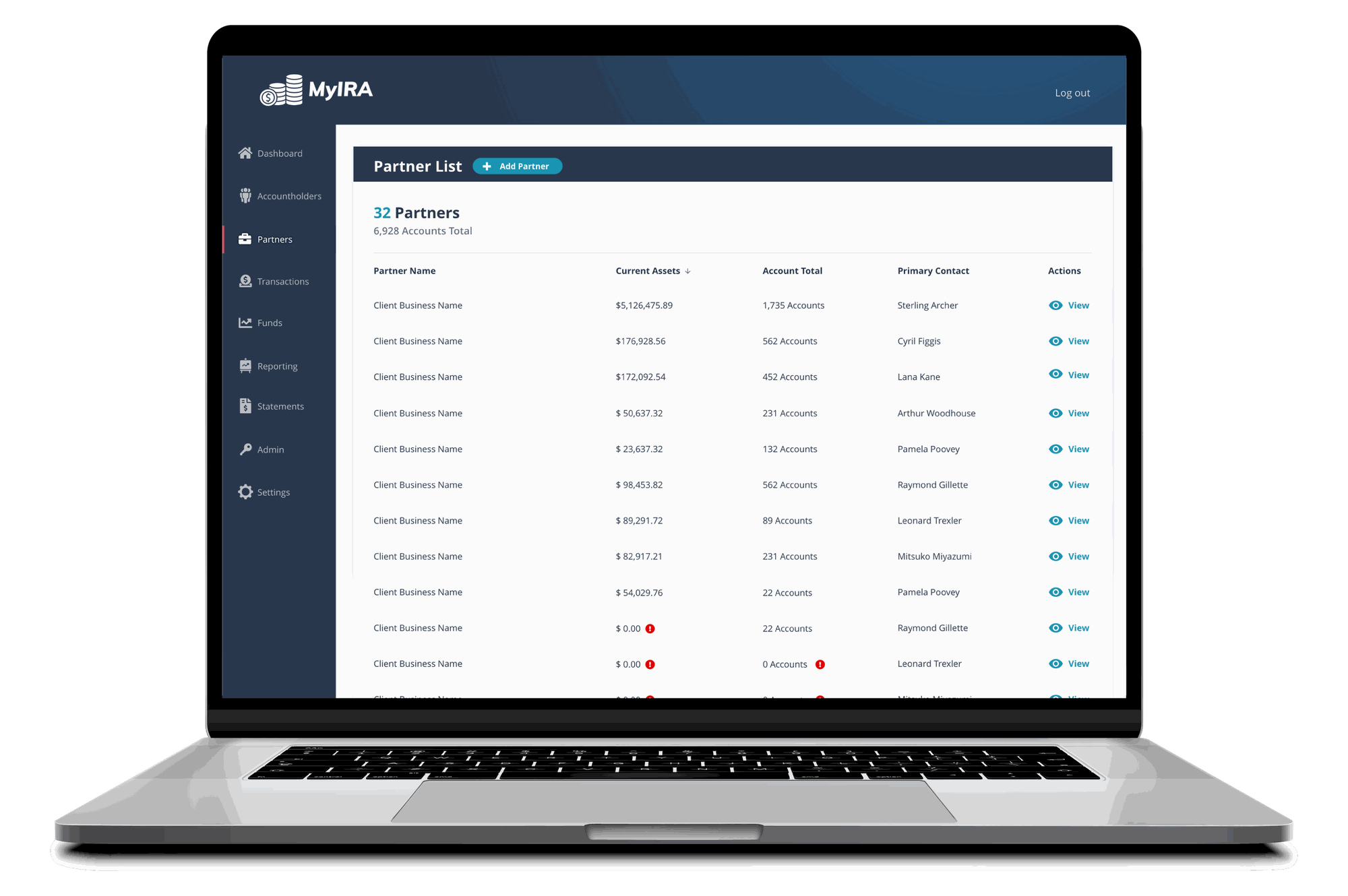
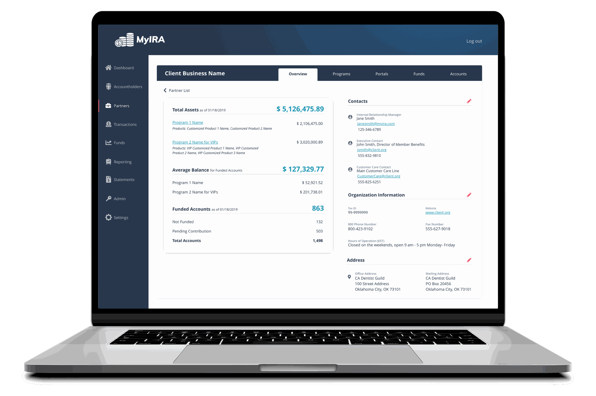
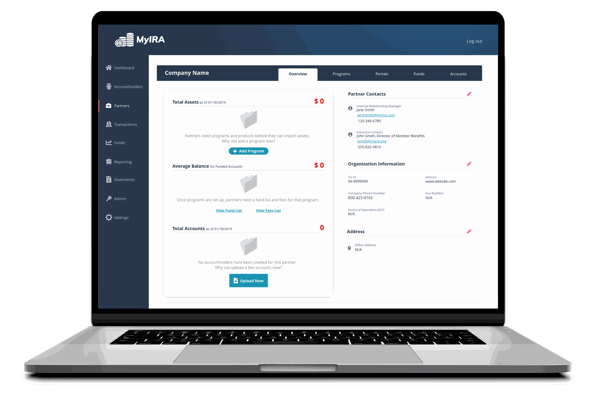
As a B2B2C company, operations needed a way to view client partner programs at-a-glance, onboard new partners, and manage bulk account creation for clients with existing accountholders — including a partner list, partner profile with key analytics and contacts, and empty states that guide operations staff through non-linear onboarding.
Partner List — every client business with a program in the system.
Partner Profile — key analytics, client company contacts, and organization information on the initial screen.
Profile Empty States — onboarding a new client is non-linear; empty states surface next steps and flag blockers along the way.
Bulk Creation & Monitoring
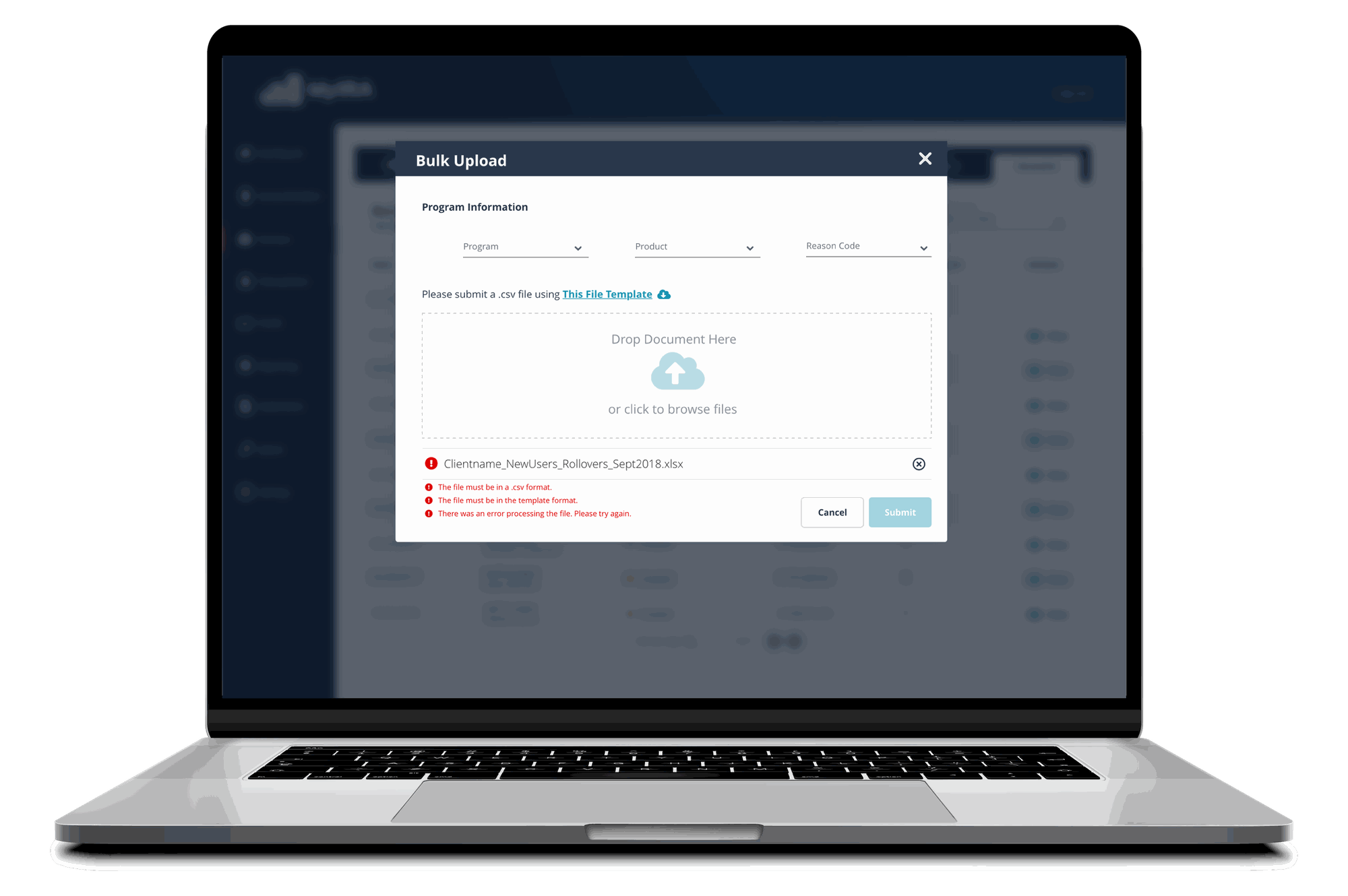
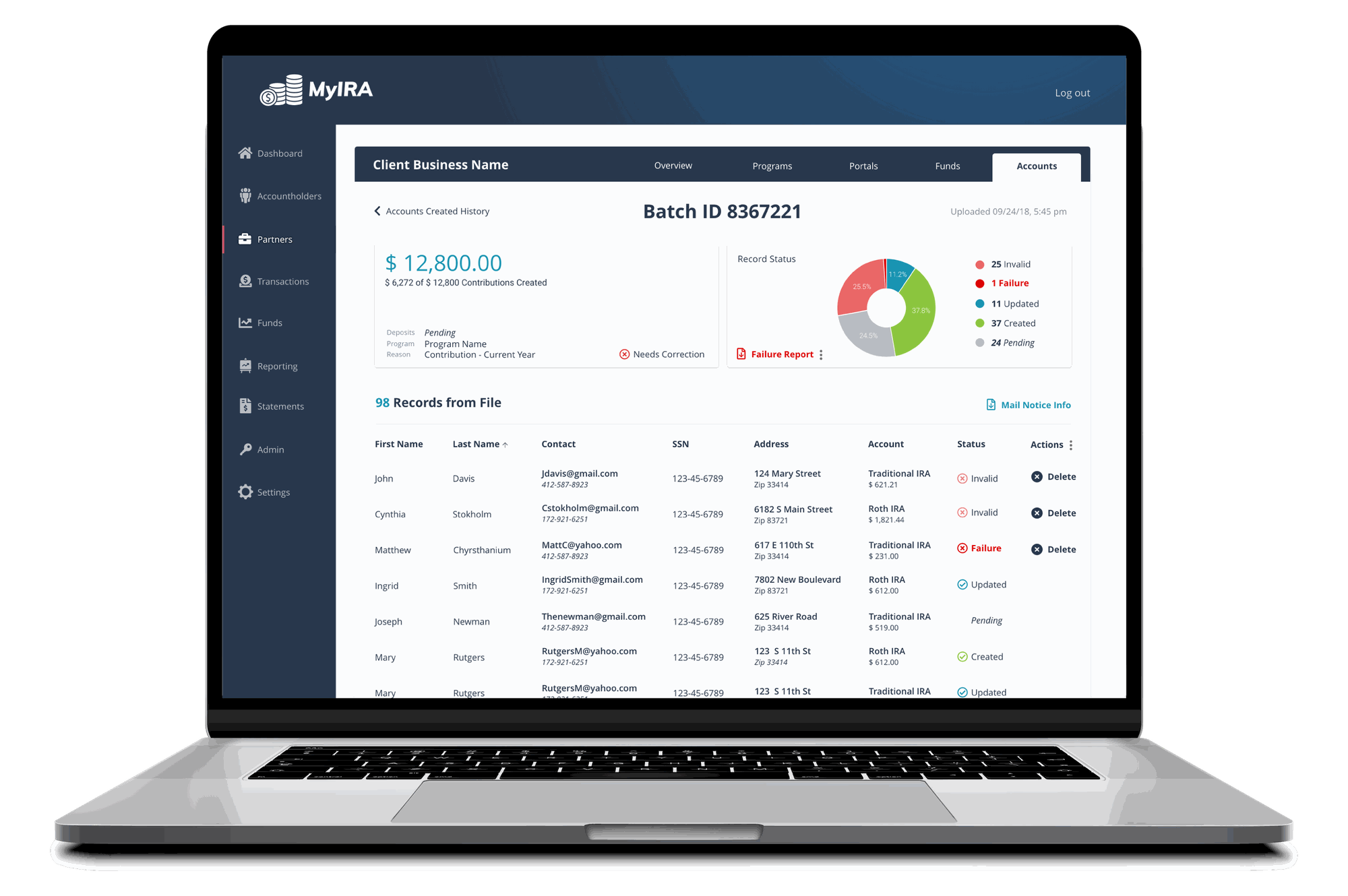
Staff can bulk-create accounts via CSV (with a file upload utility including a template and inline error feedback), monitor accounts being created in the system, and correct data inaccuracies without waiting on engineering support.
File Upload Modal — a CSV upload overlay with a template link and inline error feedback.
Account Creation Monitoring — staff monitor accounts as they're created and reinitiate the process for any records with bad data.
Beyond what's shown here
The full system spans 180+ screens. Beyond what's shown here, it includes reporting utilities (assets-under-management, assets & shares, and fee reports client companies run themselves), role-based admin controls (Call Center, Manager, and Administrator permission tiers), and additional fund-change and transaction-detail workflows — some already implemented and confidential, others still on the roadmap.
Outcome
Reflection
Operational software succeeds or fails on how well it's negotiated against technical reality, not how polished the mockups look. Learning the backend architecture well enough to negotiate directly with senior engineers — rather than handing off idealized designs and iterating after the fact — is what let this system scale to 180+ screens without major rework.
The role-specific dashboard split also proved durable: years later, designs from the earliest phase of this project are still organizationally relevant and remain on the active roadmap.
That durability wasn't automatic, though. Some of the earliest utilities were designed when the company was still small, and organizational workflows changed quickly enough that a few became outdated rather than durable. In hindsight, I'd have budgeted time to revisit the backlog with Product more frequently instead of assuming early designs would stay relevant on their own.