Pittsburgh Pride Website Redesign
Pittsburgh Pride is organized by a consortium of local LGBTQ+ nonprofits, including TransYOUniting, which took over the event in 2021 when its previous organizer, the Delta Foundation, disbanded. After the change in leadership, Pittsburgh Pride had no dedicated designer, and the website hadn't caught up to who the organization had become.
How might this website embody Pittsburgh's unique LGBTQ+ community and illuminate the work of its new leadership?
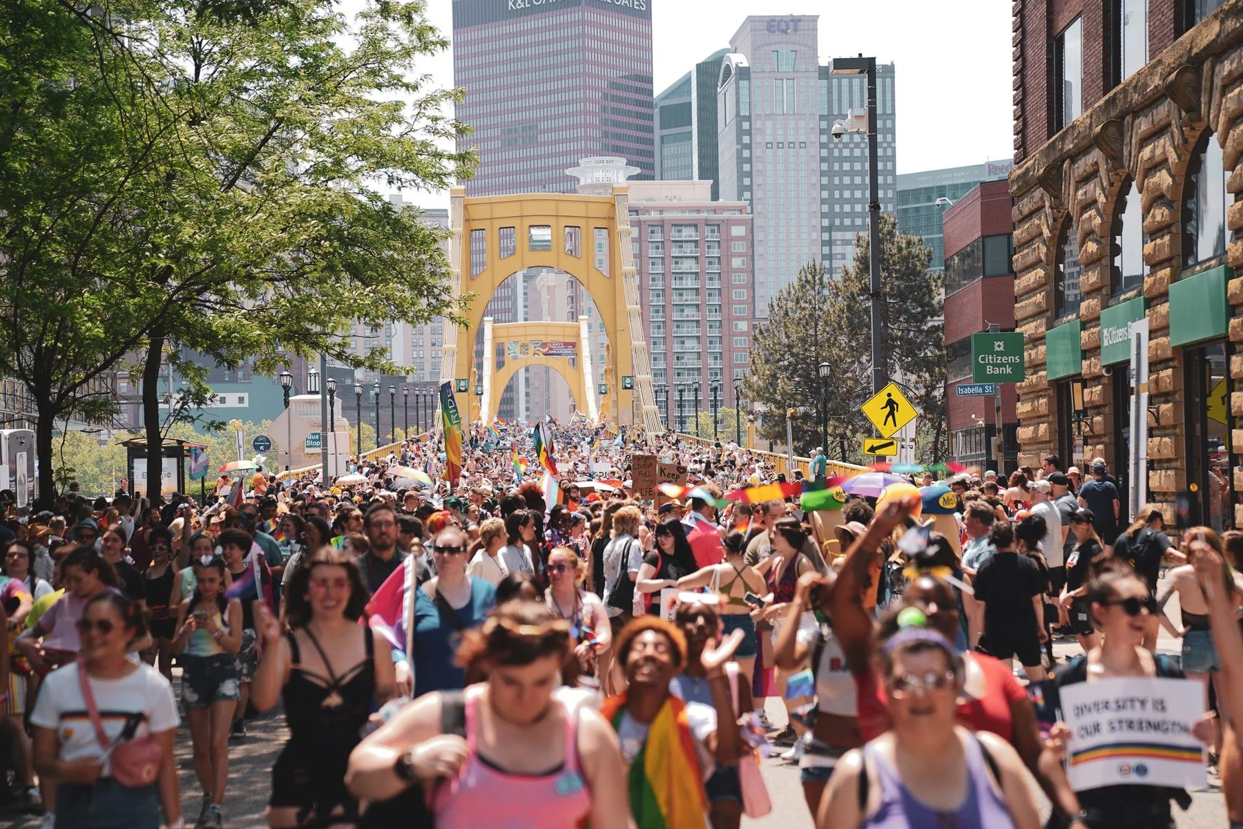
My Role
Pro bono web designer for Pittsburgh Pride through inSkapa Design, my design studio. I led comparative research, site architecture, and visual design, and built the site in WordPress with Elementor and custom code.
The Problem
Without ongoing design support, the site had accumulated the usual symptoms of neglect: inconsistent navigation, difficulty locating key actions like volunteering, vending, or performing, unclear visual hierarchy, poor mobile responsiveness, and an inconsistent visual style.
But there was a bigger problem than any of that. Broadly, many people in Pittsburgh's LGBTQ+ community didn't know a new group had taken over Pride. The Delta Foundation's besmirched reputation lingered, and few realized the event was now run by trusted local nonprofits with Black trans leadership at its forefront — noteworthy given that Pittsburgh Pride is one of the few Pride events in the country that centers Black trans leadership, in a city with an unusually tight-knit and well-organized network of LGBTQ+ nonprofits.
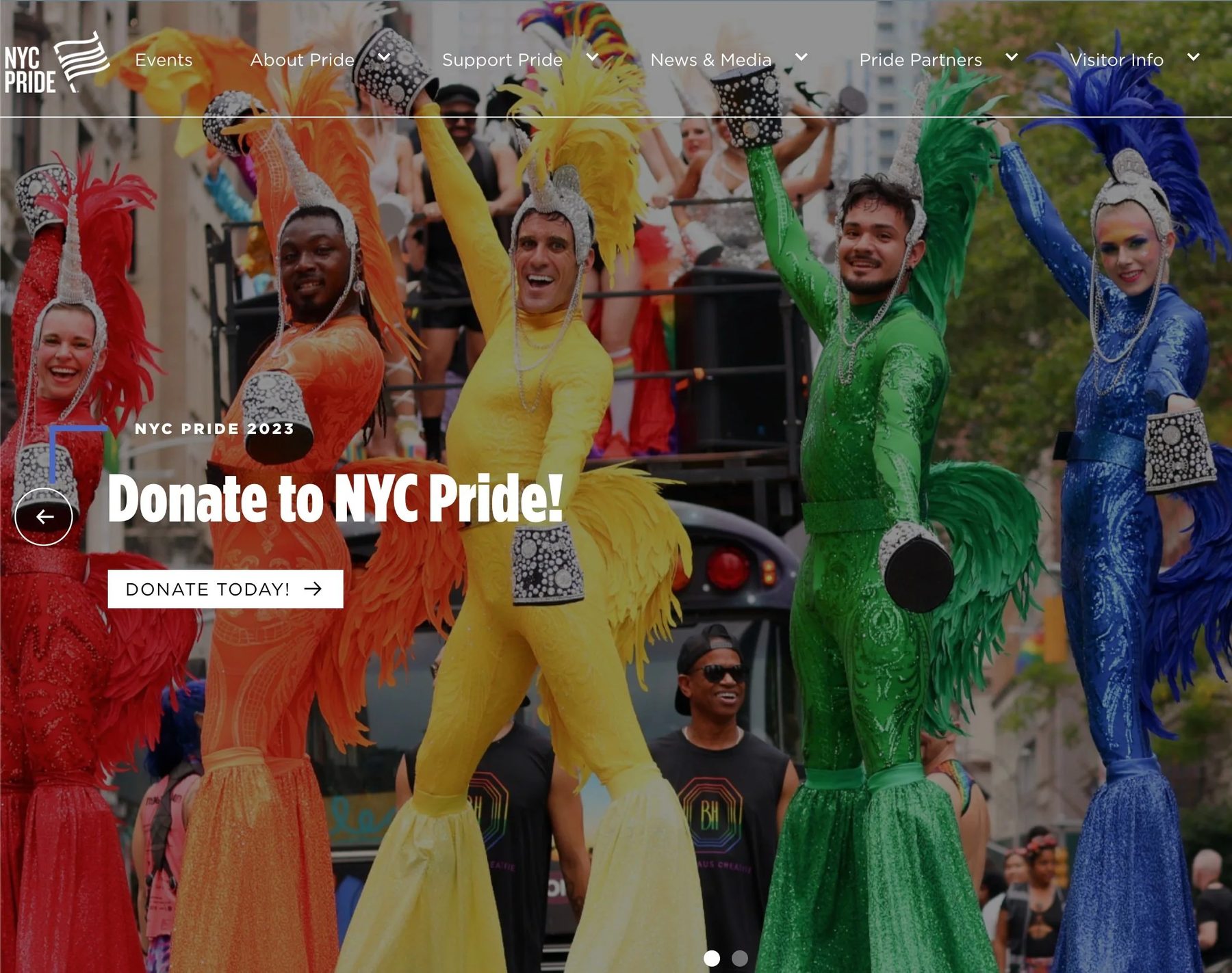
The NYC Pride website, referenced during comparative research.
Process
- Comparative analysis of Pride websites for major cities, evaluating what worked and didn't for each
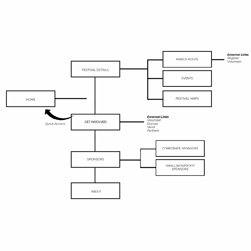
- Site inventory and a new site map, reorganizing navigation around action items leading up to the event
- Sketched the new information architecture, then built it out in WordPress with Elementor and custom code
Key Decisions
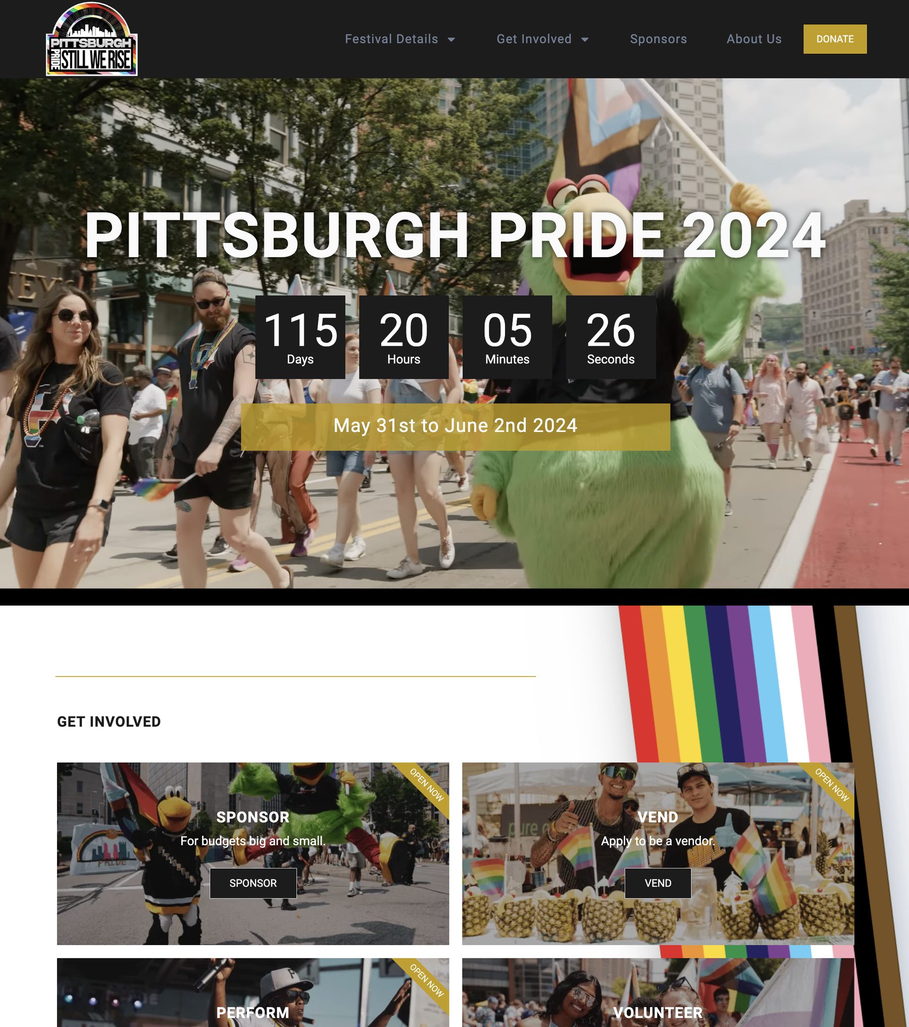
A video background instead of static photography
Options considered: Keep the existing static hero photography vs. use event video, similar to what LA Pride does on its homepage.
Decision: Built the homepage around a video background from the previous year's event.
Why: Comparative research across major-city Pride sites showed video communicated energy and culture in a way static images didn't — and communicating that energy mattered more than usual here, given how much of the community still associated Pittsburgh Pride with its previous, disbanded organizer.
Action items ordered by countdown to Pride weekend, not fixed
Options considered: A static set of homepage action items vs. an ordering that changes based on how far out the event is.
Decision: Months out, preparatory actions (Sponsor, Vend, Perform, Volunteer) lead the homepage; a month before Pride, those get replaced by March Route, Events, and Festival Maps.
Why: NYC Pride's approach of putting key action items in an image gallery right on the homepage made participation top of mind, but a single fixed list would have been the wrong priority order for most of the year — site visitors need fundamentally different information depending on how close the event actually is.
New copy naming the leadership change explicitly
Options considered: Let the new site's design speak for itself vs. write copy that directly names the community's biggest unspoken concern.
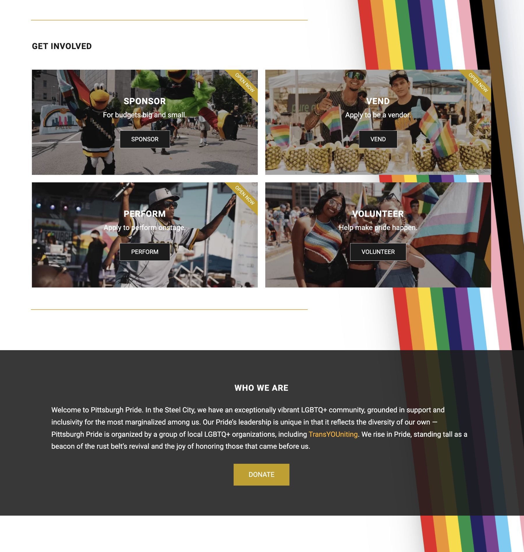
Decision: Crafted a homepage blurb that explicitly expresses Pittsburgh Pride's uniqueness and its community, rather than leaving the leadership change implicit.
Why: The core problem here wasn't navigational — it was that most of the community didn't know trusted local nonprofits, with Black trans leadership at the forefront, had taken over from a disgraced former organizer. No amount of IA cleanup fixes an awareness gap; the copy had to say the quiet part directly.
The Design
We sketched the new flow of information, then sifted through hundreds of photos from the previous year's Pride to select images that captured both context and visual identity.
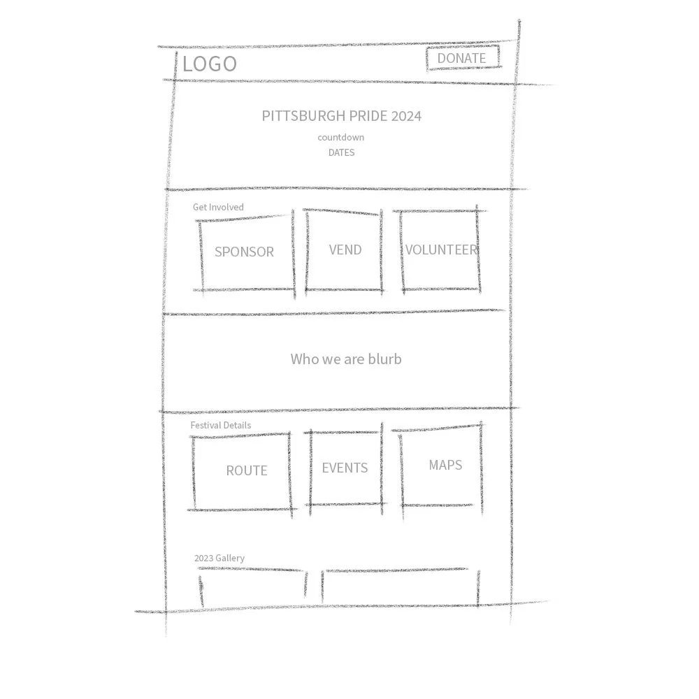
Early sketch of the new homepage layout.
Before
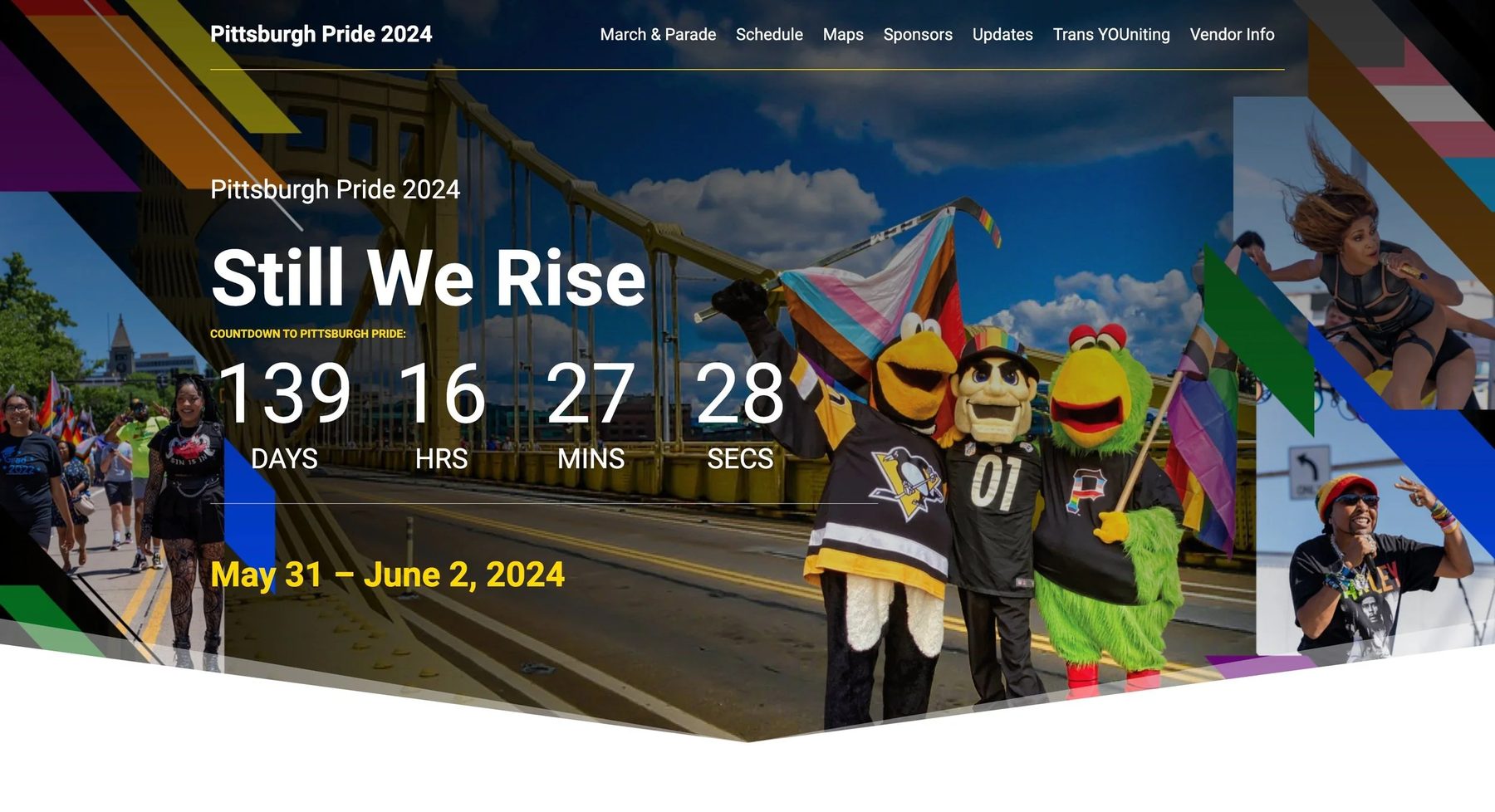
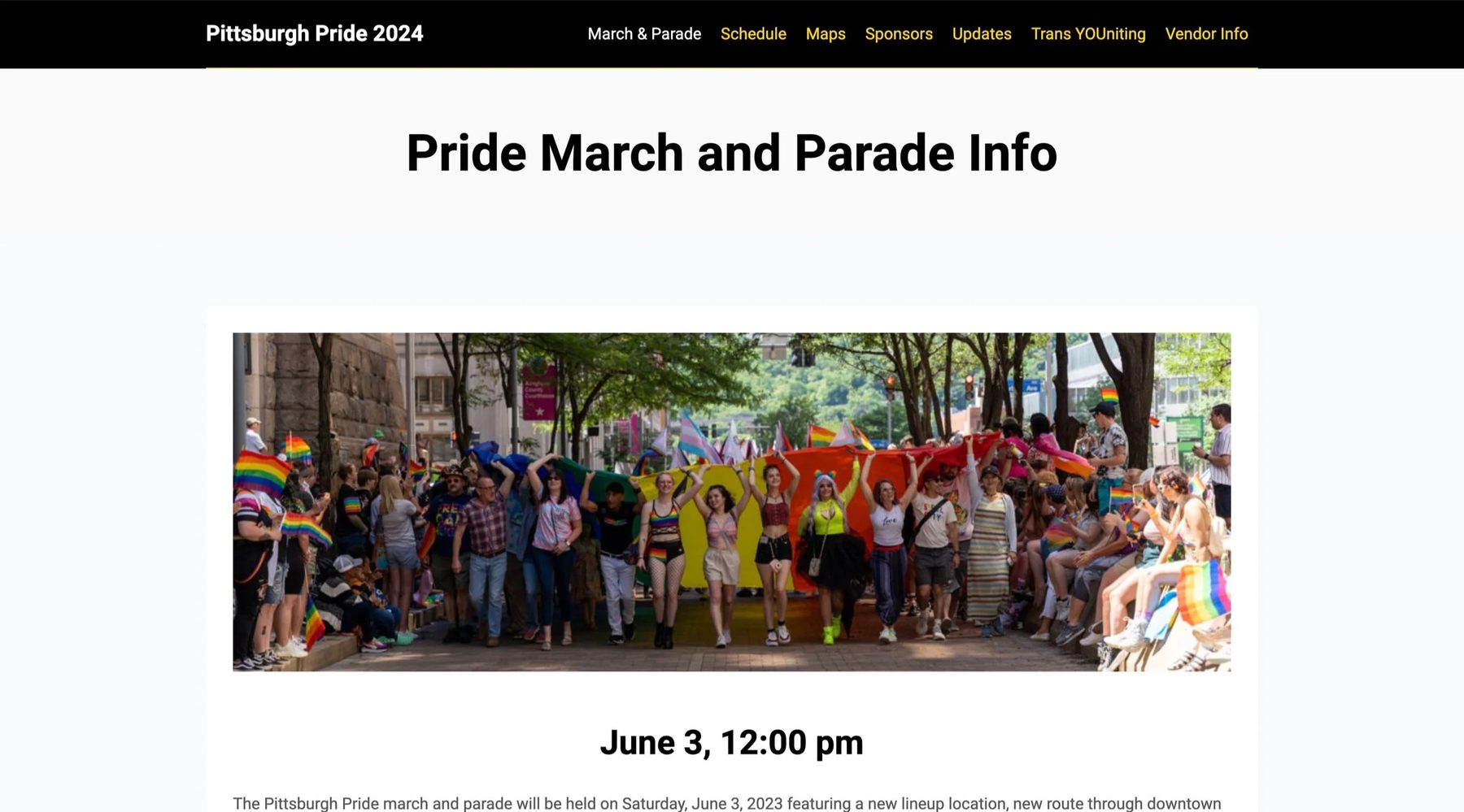
After
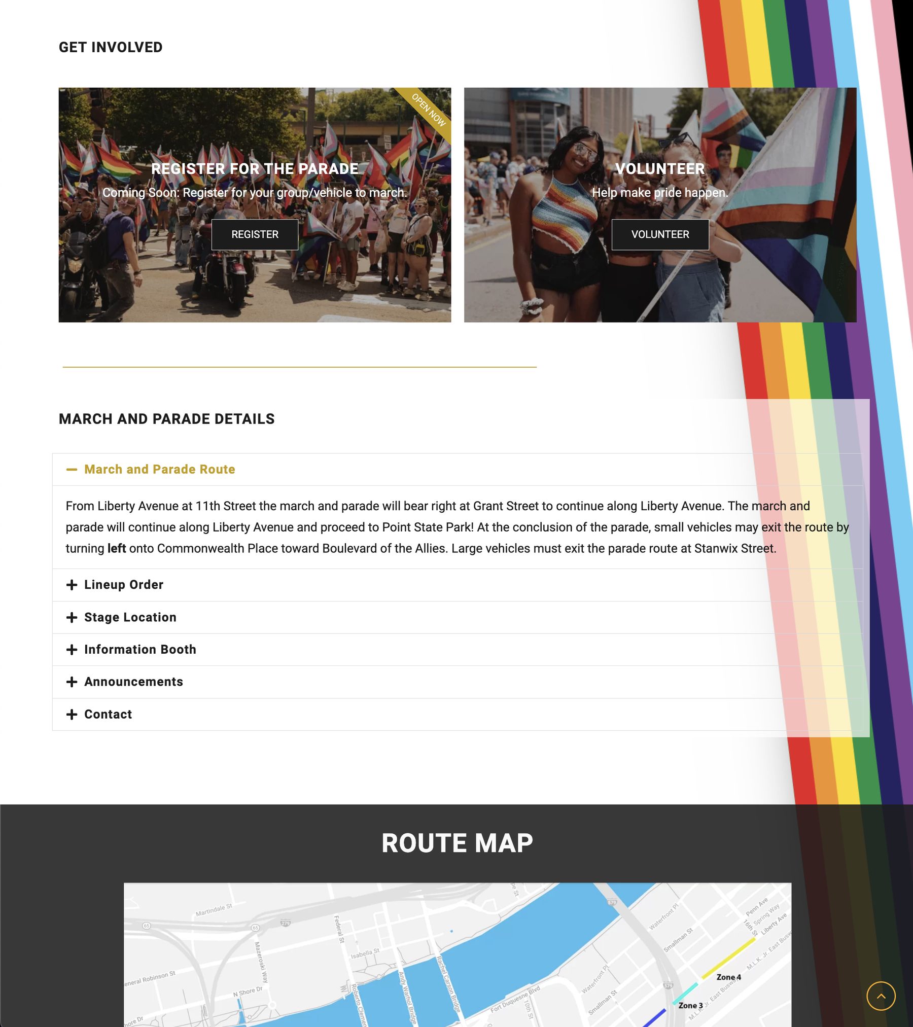
A video background on the homepage to capture the energy of Pittsburgh Pride's live events; action items prioritized to encourage engagement leading up to Pride; a blurb crafted to express the uniqueness of Pittsburgh Pride and its community; and improved organization of event details.
Outcome
Reflection
This project was less about screens than about trust. Pittsburgh Pride's actual problem wasn't primarily a UX problem — it was a communications problem wearing a UX problem's clothes: a community that didn't yet know who was running its Pride event, or why that mattered. Good IA and a video background wouldn't have accomplished much on their own without copy that said directly what had changed and why the new leadership was worth trusting.
This is also the project on my site most directly tied to community and nonprofit work rather than shipped product metrics. I'd take on more of it — it's a different kind of design problem than fintech dashboards, and closer to the work I did with The Met's internship program and other education and museum roles earlier in my career.