IRA Account Portal Redesign
You've just been hired by a B2B2C fintech startup. You are their first UX hire and one of the first 15 employees. They show you their product, a white-labeled IRA account portal developed in seed round.
We know we need a redesign. Considering our stage, technical limitations, and fundraising needs, how do we create a product vision that will evolve with us?
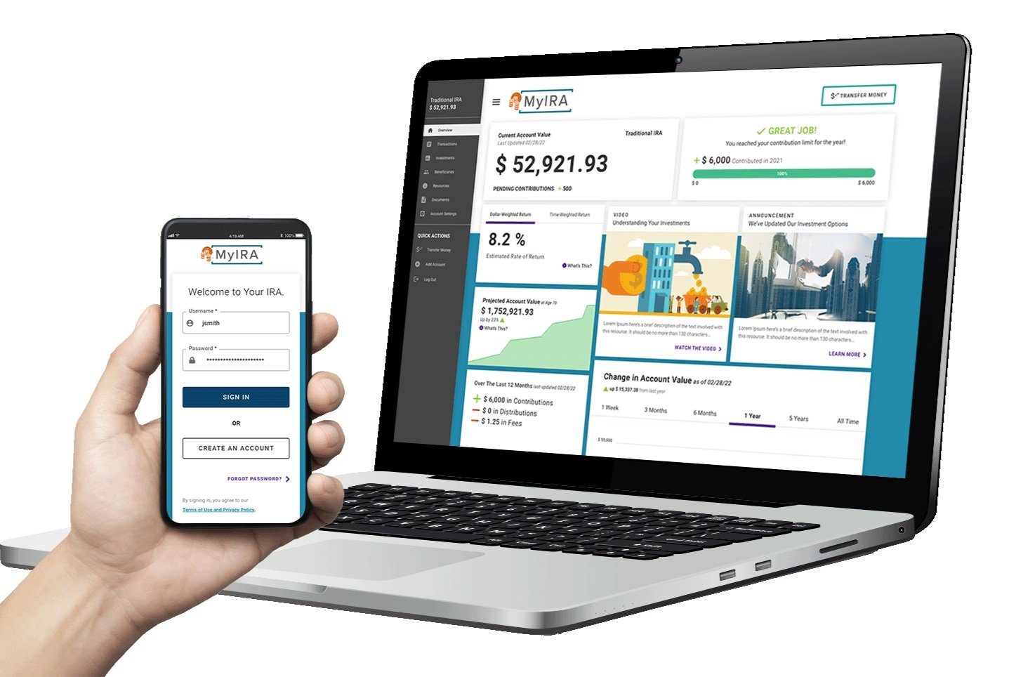
The original portal design at seed stage
Outcomes
Problems to Solve
User Experience
Onboarding, workflows, navigation, and terminology cause confusion. As a result, customer care gets avoidable calls from confused accountholders.
Visual Design
The white-labeled design implements branding in a way that causes WCAG compliance issues with some brand colors and logos. Icons/graphics aren't contextually supportive or visually consistent.
Competitive Analysis
The portal lacks industry-standard features such as payment processing via linked bank accounts, ID verification alternatives to security questions, and analytics such as rate of return.
Performance
There are code bottlenecks— this portal can't handle load as the company scales and the number of accounts in production grows.
The Design Process
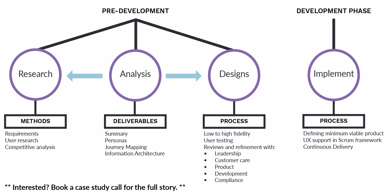
- Collect initial requirements from the business
- Conduct user research and competitive analysis (combining qualitative and quantitative methodologies)
- Deliver generative analysis (summary, personas, journey maps)
- Information architecture (site map and testing new navigation)
- Deliver designs (low to high fidelity, testing, review, and refinement)
- Define Minimum Viable Product and provide UX support throughout development and continuous release
Key Features
Enrollment Process
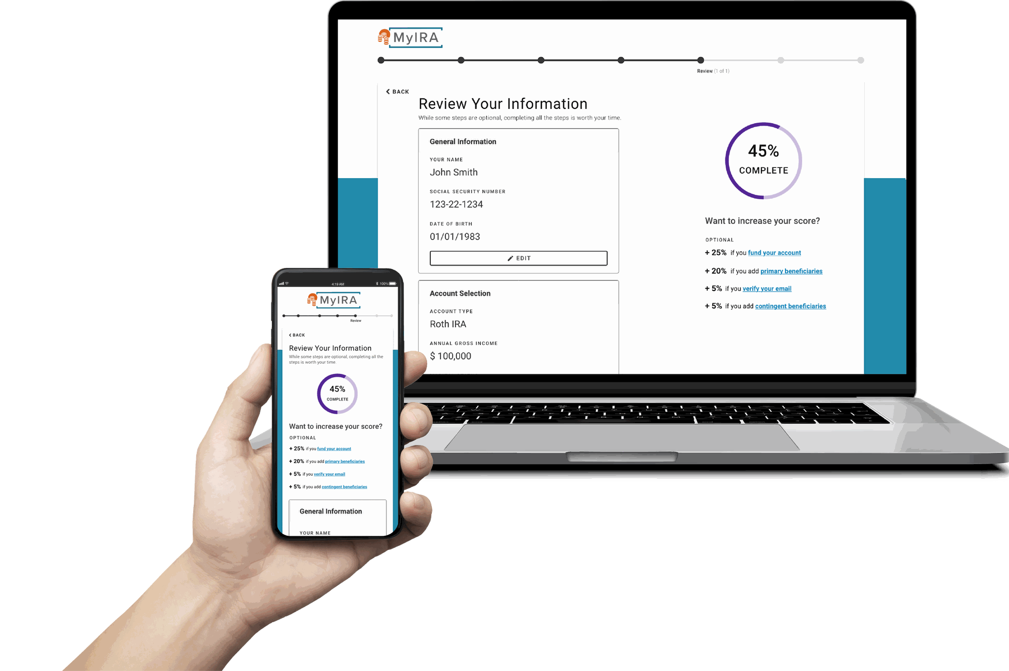
Options considered: Leave enrollment as a single long form with no progress feedback (the original design) vs. break it into visible steps with completion and progress indicators.
Decision: Added a progress bar showing where users stood in the flow, a completion score nudging them through optional fields, and an in-flow prompt to set up a contribution schedule (autopay).
Why: Research tied the original form's drop-off to users not knowing how much was left, and its all-or-nothing field design meant people skipped optional fields that customer care later needed to resolve calls. Visible progress addressed the drop-off directly, while a completion score cut missing data without making every field mandatory. The autopay prompt used that same moment of momentum to increase assets under management — a metric leadership was tracking closely ahead of the funding round.
Dashboard Overview
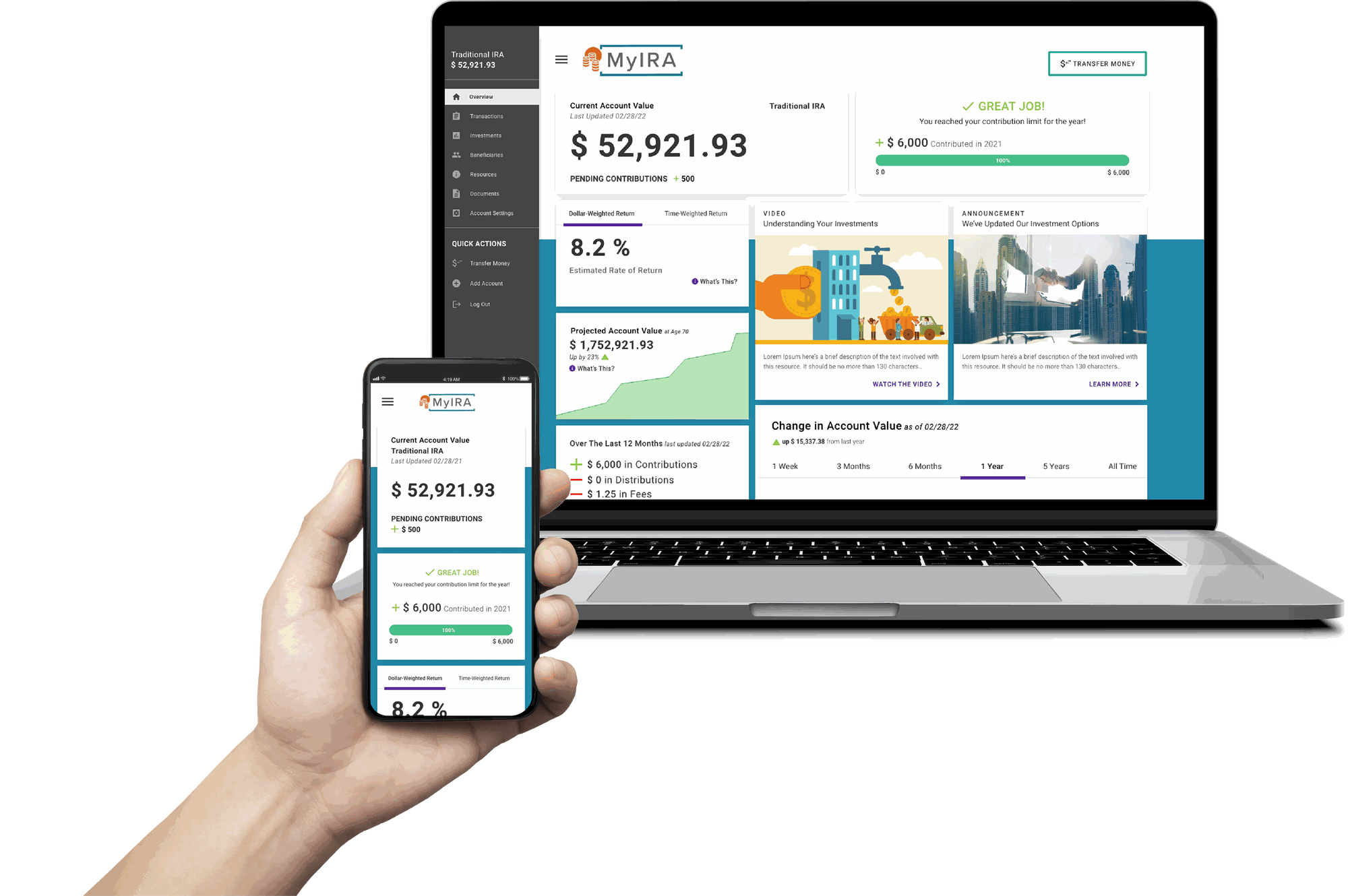
Options considered: Keep the dashboard as a static balance summary (the original design) vs. rebuild it as a modular set of cards surfacing pending transactions, contribution limits, and account projections independently.
Decision: Built a card-based dashboard: pending transactions shown next to the balance, a contribution progress bar against the annual IRS limit, and cards for rate of return and projected account value.
Why: The single largest driver of avoidable customer care calls was users panicking over a temporary $0 balance mid-transaction — surfacing pending activity on the overview screen addressed that directly, and was one of the top 10 call-volume causes this redesign was scoped to fix. The card structure also meant client-requested features like ROI and projections could ship as new cards instead of a UI rework, which mattered given how often client companies asked for new data views.
Resources
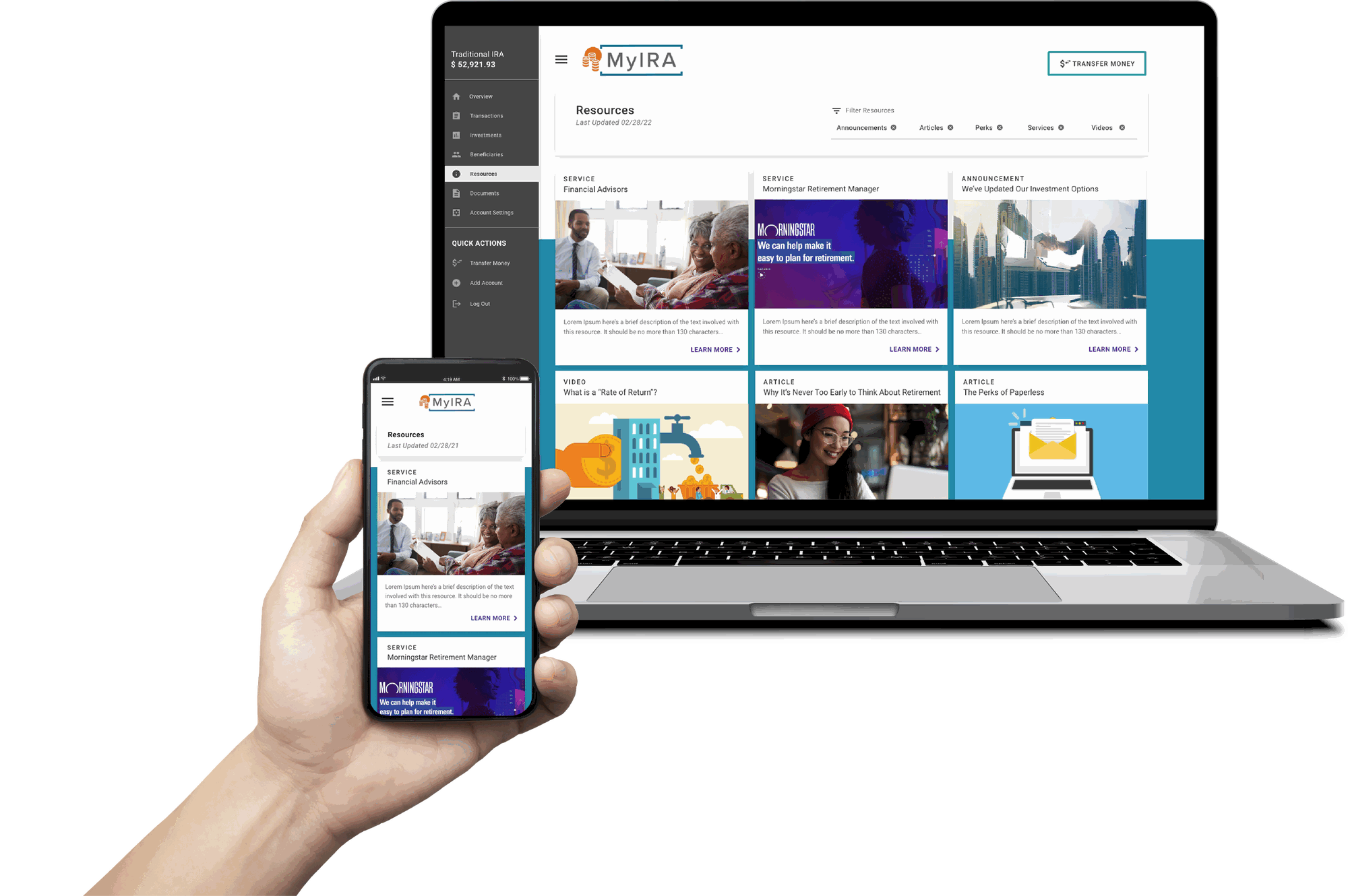
Better adoption of add-on services: The resources tab advertises client company financial advisors, managed accounts, and more.
More support for user financial literacy: Articles and videos can empower users to save and manage their investments effectively.
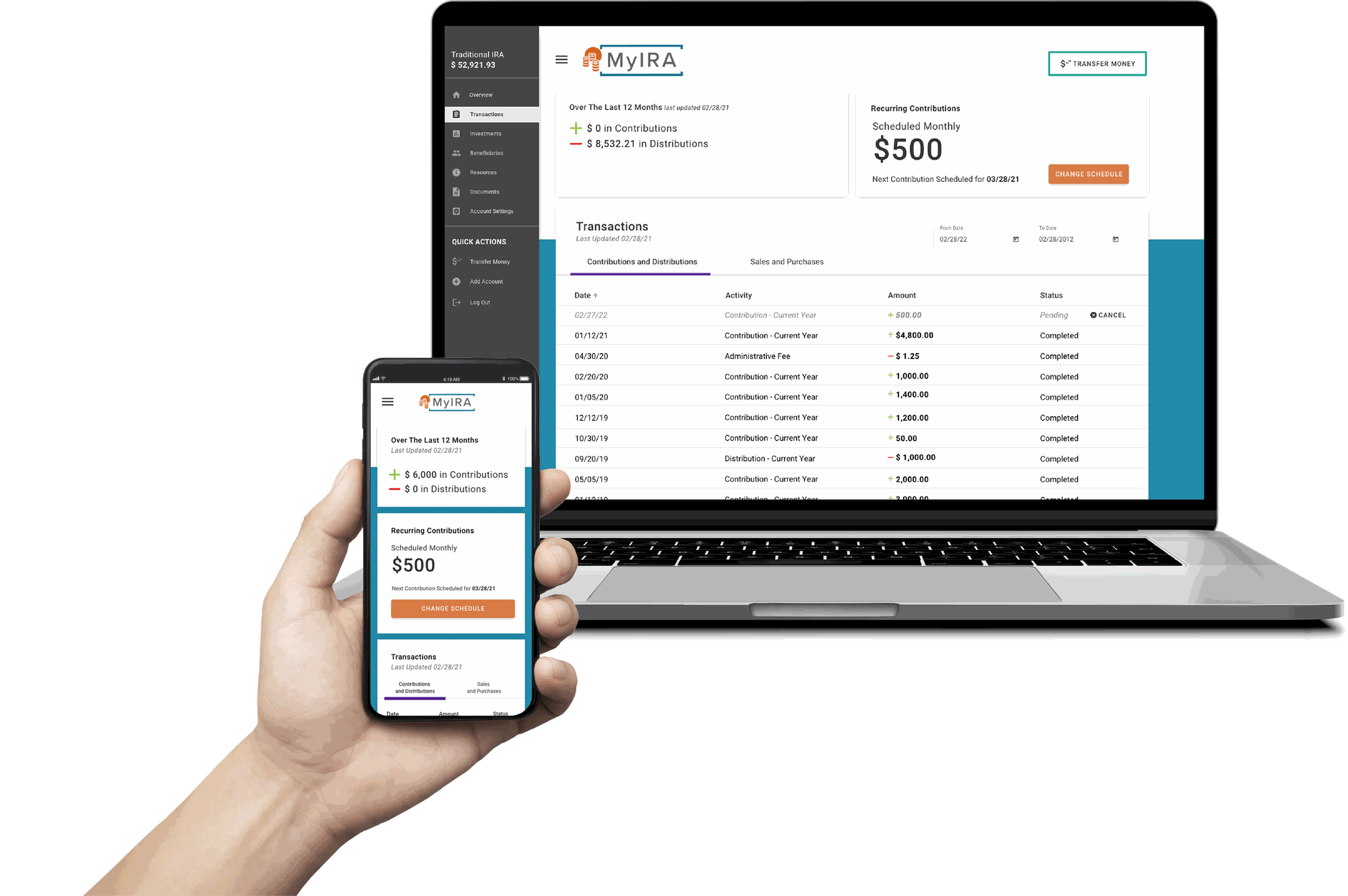
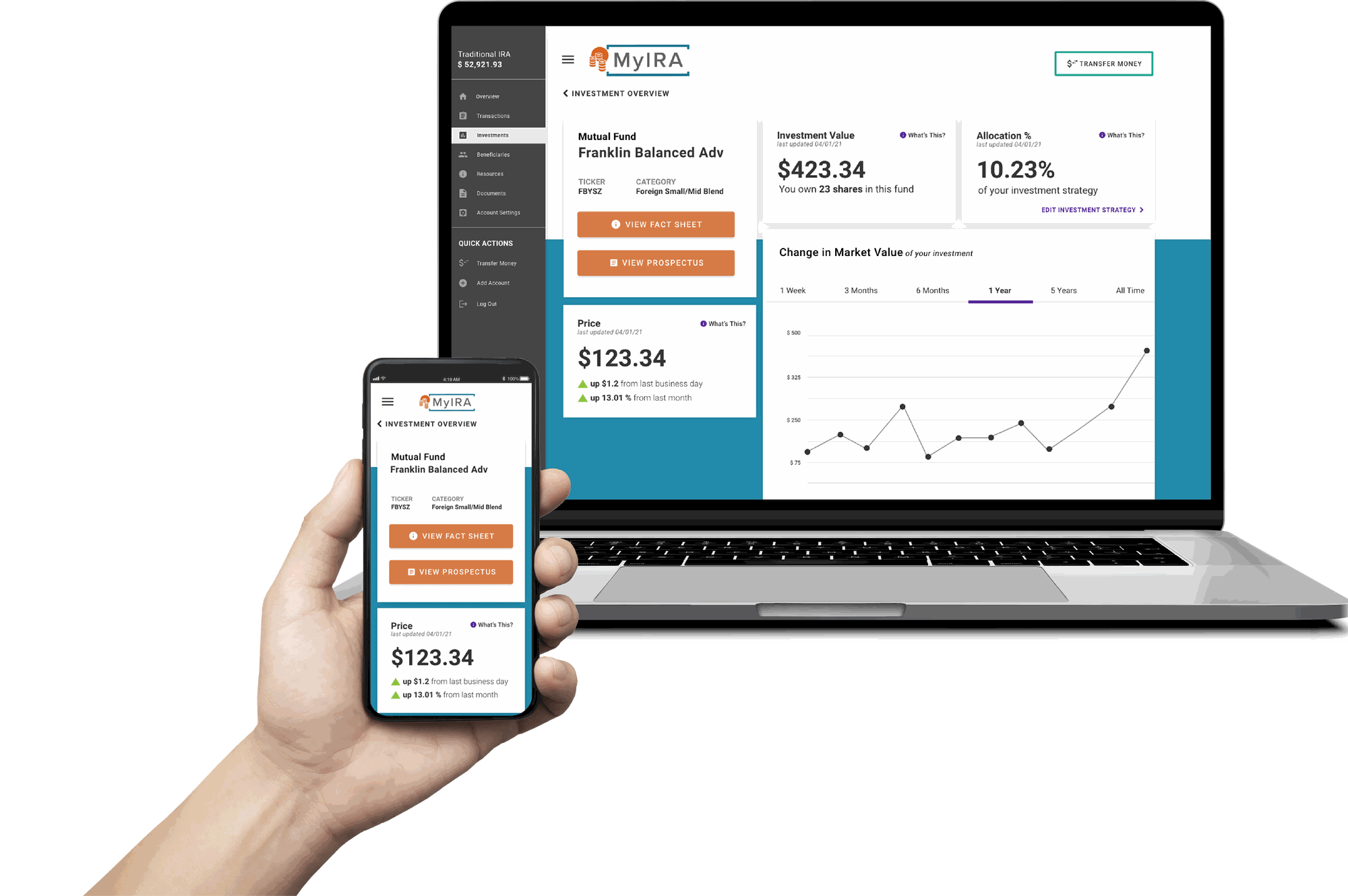
Transactions & Fund Details
White Labeling
The new portal keeps brand color and logo separate from key UI elements, so branding never interacts with fields, titles, or other functional components in the background. This improved WCAG conformance across client brand palettes and enabled far greater logo and color variability among client companies without one-off rework for each new client.
Challenges
We didn't own the users
As a white-labeled product, end users were clients of our client companies, not ours directly — I couldn't reach current accountholders for qualitative research. I worked around this by recruiting from the target demographic instead, and treated that as a known limitation rather than pretending the research was equivalent to talking to real accountholders.
The roadmap moved underneath the project
Company priorities shifted hard in 2020, and I had to get hundreds of screens development-ready far sooner than planned — while simultaneously building out the UX team. I embedded designers directly into Scrum teams and refinement sessions so review didn't become a bottleneck, at the cost of some designs getting less in-depth technical review than I'd have liked.
The MVP had to shrink under a fixed launch date
Options considered: Push the original launch date to preserve the full design scope vs. cut scope aggressively to hit a fixed, fundraising-driven deadline.
Decision: Ran MoSCoW prioritization (Must/Should/Could/Won't Haves) with Product and Development — cutting anything that wasn't core functionality, wasn't tied to lowering call volume, or lacked user research behind it, while protecting everything that met those criteria.
Why: The launch date wasn't movable. MoSCoW gave the team a defensible, criteria-based way to cut scope fast without the cuts feeling arbitrary to stakeholders, and it left behind a real post-launch enhancement plan instead of just quietly dropping the deprioritized work.
Reflection
As the company's first UX hire, most of this project's leverage came from turning support call logs into a design roadmap — the biggest wins here weren't visual polish, they were tracing specific complaints (a scary $0 balance, an abandoned enrollment form) back to their root screens and fixing those directly. That's the version of "improving user experience" that survives contact with a startup's actual priorities: fewer calls, more completed enrollments, numbers a fundraising deck can use.
Working at an early-stage startup also meant looking at the design from both a bird's-eye and a detailed view at once. To do that well, I had to develop real subject matter expertise — understanding the company's product, industry positioning, and backend processes from top to bottom, not just the screens I was drawing.
The modular dashboard was the one decision that outlasted the redesign itself — years of new client-requested features have shipped as additional cards without another UI overhaul, which is the real test of whether an early-stage information architecture decision was right.