Evolving a Design System for Client Whitelabeling
The company was consolidating its product suite onto a single, universal design system, built by a dedicated design system team. Several of my own product areas served clients who whitelabel the company's coaching and training products under their own branding — but the new design system had been built without accounting for that use case.
How do we evolve a design system built around one visual identity into one that can support many client brand identities, without breaking WCAG accessibility conformance and without requiring the design system team to rebuild it from scratch?
My Role
I wasn't part of the core design system team, but I'd designed several whitelabeled platforms in prior roles and knew the common failure points — brand colors breaking contrast ratios, logo lockups conflicting with UI chrome, inconsistent legibility across client palettes. I took the design system team's existing work and evaluated how it could evolve to meet whitelabeling needs while holding the line on accessibility.
Process
- Audited the new design system against known whitelabeling failure points from prior experience
- Ran this as an independent audit and proposal rather than through formal joint review sessions with the design system team — validated proposed component variations against real client brand palettes, not hypothetical ones
- Proposed and designed component variations (buttons, sign-in flows, configuration patterns) that preserve WCAG conformance across a range of client brand colors
- Presented the audit and proposal to stakeholders; it was well received and added to the product roadmap
Key Decisions
Constrain client branding to a small set of low-risk UI surfaces
Options considered: Allow client brand color to flow broadly through the interface (buttons, backgrounds, navigation) vs. constrain it to a limited, pre-approved set of surfaces.
Decision: Limited where client brand color could appear — giving each client a clear "pop" of their brand identity in specific zones, without weaving it through core UI chrome.
Why: From prior whitelabeling work, I knew the more a client's branding touches key UI elements, the more likely two things happen as new brands get onboarded: the UI breaks, and contrast ratios fail WCAG. Constraining brand exposure protected both visual consistency and accessibility without requiring a rebuild for every new client.
Standardize logo presentation against a fixed white background, at flexible dimensions
Options considered: Support each client's logo in its native file and background per brand vs. standardize how logos are presented across the system.
Decision: Client logos always render against a white background, and the surrounding layout accommodates a range of logo dimensions and aspect ratios — rather than requiring the design or engineering team to produce and maintain multiple pre-sized logo assets per client.
Why: This eliminated a recurring source of past whitelabeling defects — logos going illegible or clipped against inconsistent backgrounds — while removing the ongoing maintenance burden of multiple logo versions per client.
The Design
Button variations
Problem solved: The clearest single view of how button treatments hold up — or don't — across a wide range of client brand colors.
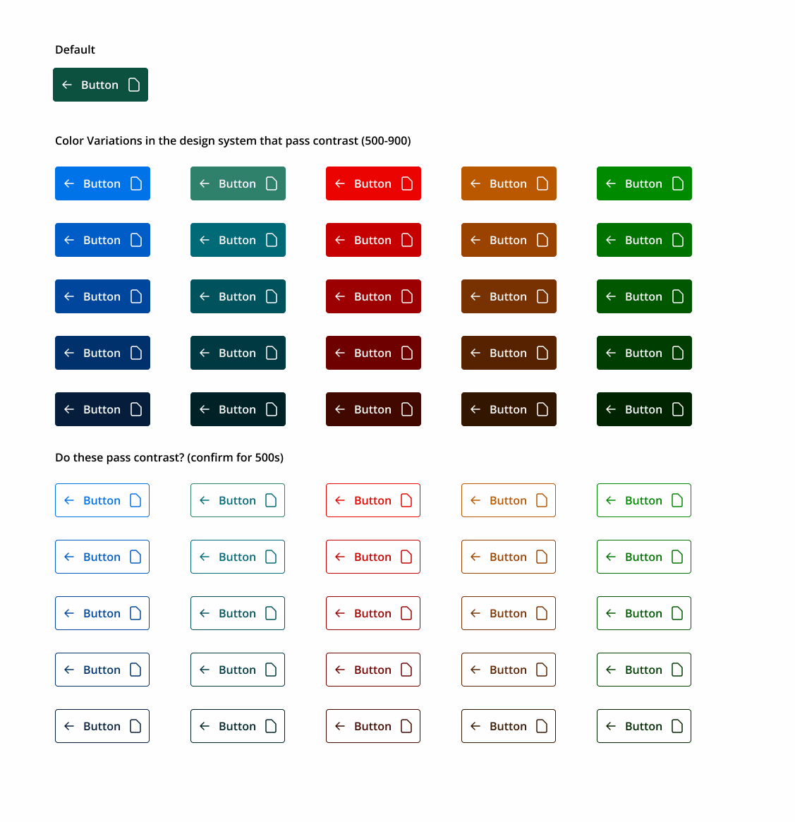
Color variations tested against WCAG contrast requirements across weights 500–900, including an open question on whether lighter 500-weight outlined buttons could pass contrast on their own.
Sign-in screen variations
Problem solved: Demonstrates the branding treatment applied consistently across different client identities on the same underlying sign-in flow — same layout, same components, distinct brand identity for each client.

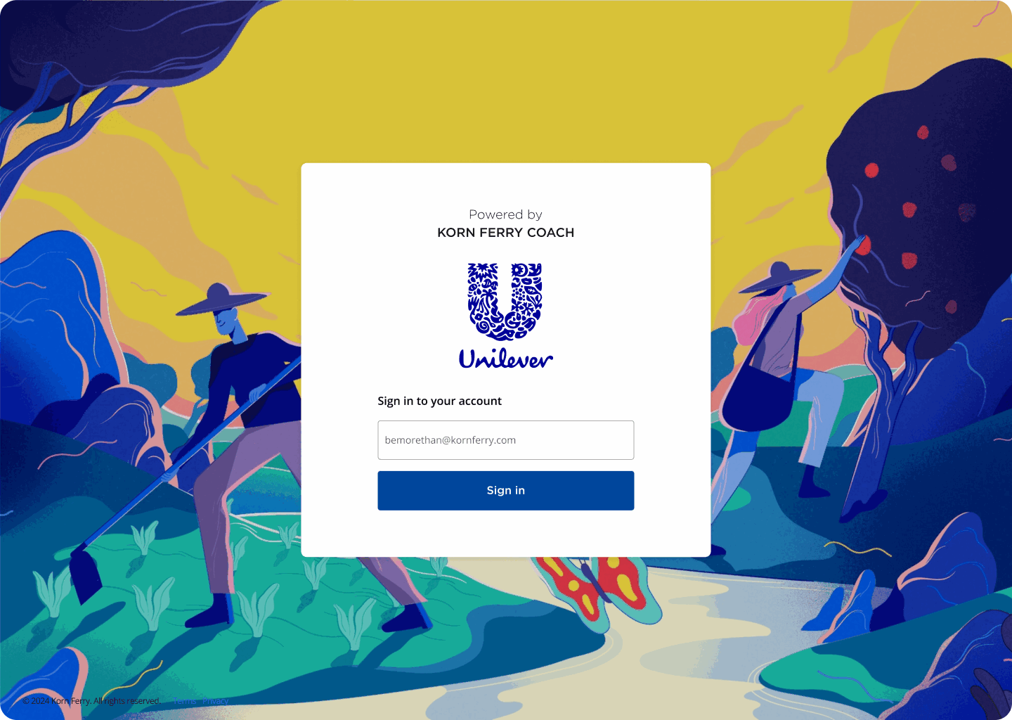
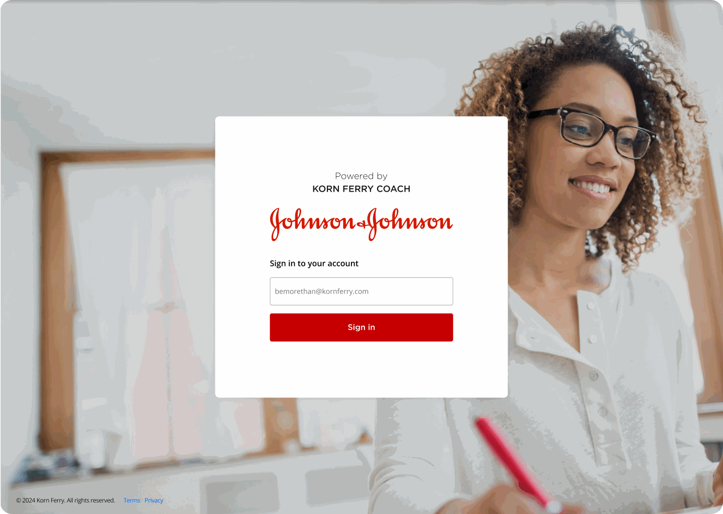
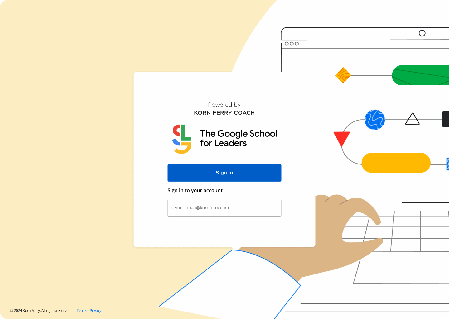
Four enterprise clients, one underlying sign-in template — brand color, logo, and imagery swap in without touching layout or component structure.
In-product theming
Problem solved: Proves the constrained-branding approach holds up past the sign-in screen, inside the actual product experience — not just a marketing-page reskin.
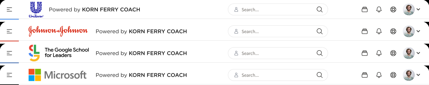
The same navigation component, re-themed per client — logo and accent color are the only variables, keeping every other UI element identical and WCAG-conformant across brands.
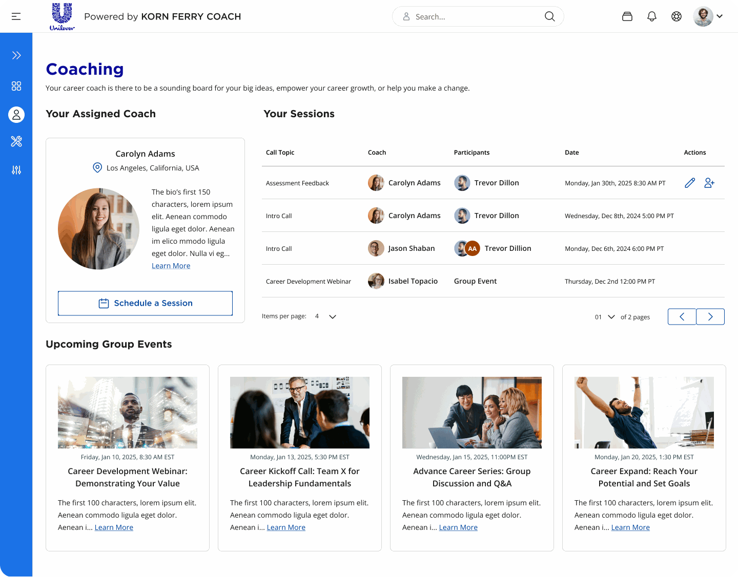
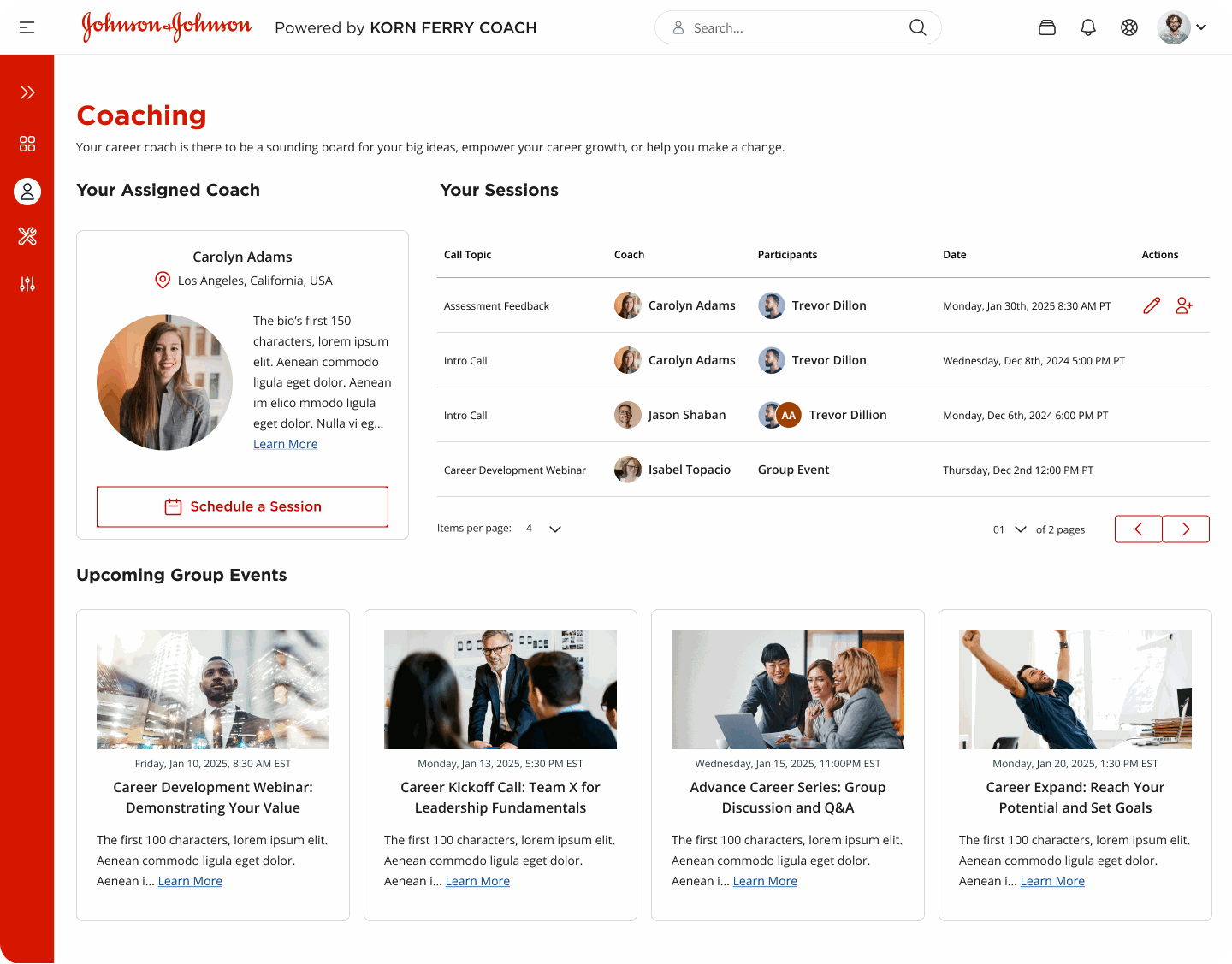
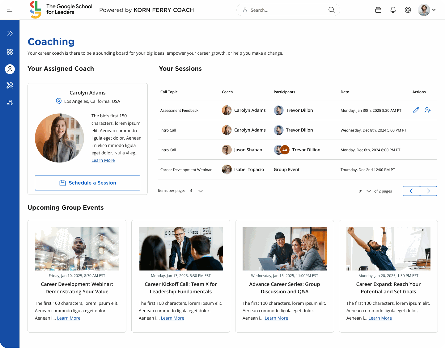
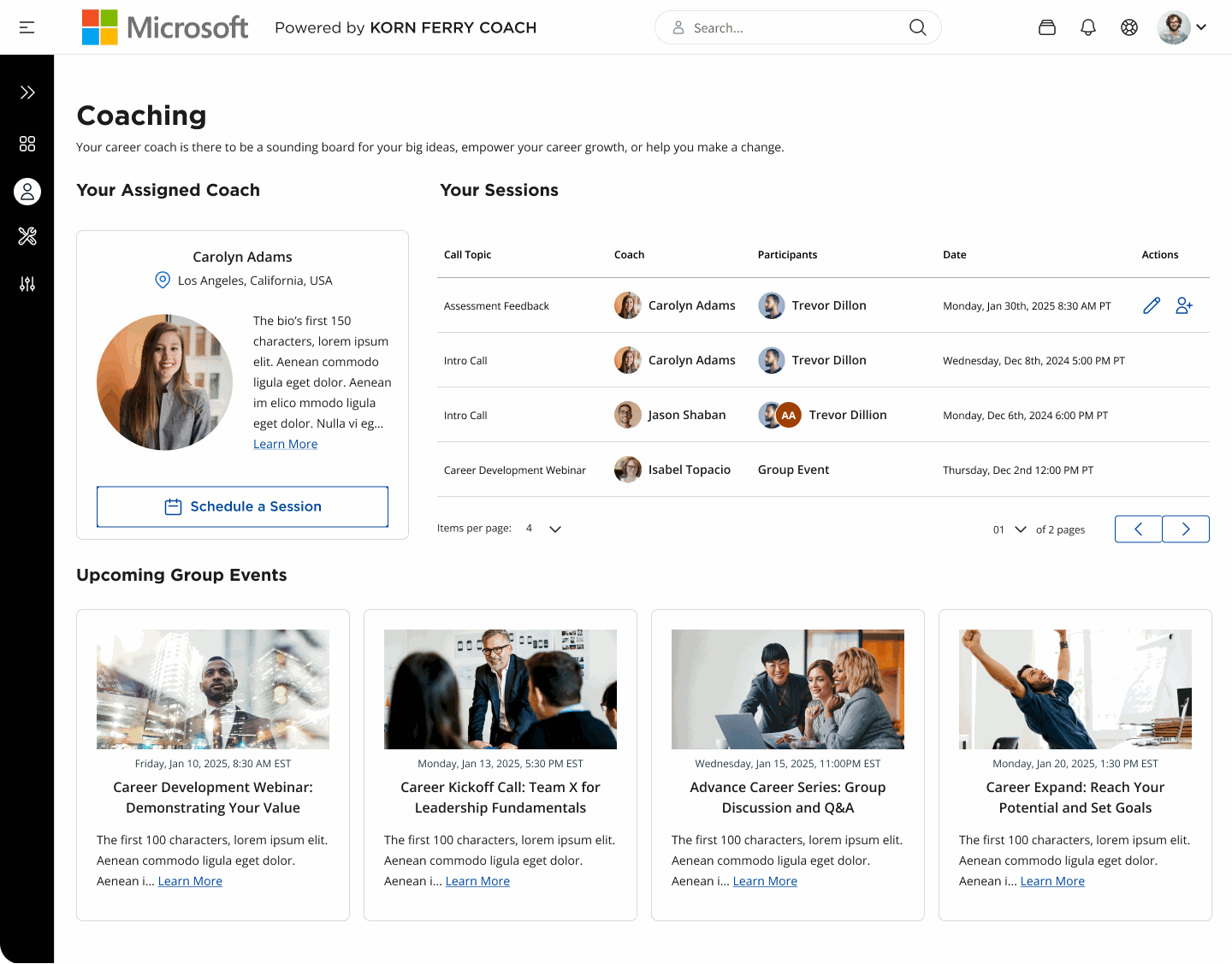
The full in-product view for each client, not just the nav bar — the constrained-branding approach holds up across every surface in the dashboard, not only the component shown above.
Outcome
Reflection
This project reinforced a pattern I'd seen before in whitelabeling work: the fewer places a client's branding is allowed to touch, the more durable and accessible the underlying system stays as new brands get added. Constraining brand exposure to a small, well-defined set of UI surfaces — rather than trying to accommodate branding everywhere — was the single decision that let the design system scale to 10+ client brands without a rebuild per client.